Hi there! Today, we're going on an adventure to learn how to make buttons in Light VN!
If you haven't read our last post about custom UI (Light VN title) as well, you can feel free to check it out here:
In the last post, I also talked a bit about buttons, which might be useful as well!
I'll also share some common button actions we can use together.
If you didn't download the light vn engine yet, you can download it on their website or itch.io:
Let's get started! ✨
How to Add / Create a Button:
1. touchableRes
1. First, we need a light vn command called 「touchableRes」
It lets you set three images for your button:
- untouched Image: This is what your button looks like when it's just chilling out, waiting to be clicked
- touched Image: This is the image that appears when your cursor hovers over the button, like a little wave saying hello!
- clicked Image: This is what the button shows when it's been pressed
(If you have experience in some other visual novel game engine, then you might know them as Idle image, Hover image and Selected Image)
Plus, you can even add sound effects for when someone hovers over the button and when they click it
the idle, hover and clicked image sizes need to be the same size, or light.vn might get a little confused
(If you've worked with other visual novel game engines before, you might know these as Idle Image, Hover Image, and Selected Image)
The error pop-up in light vn will look like this:
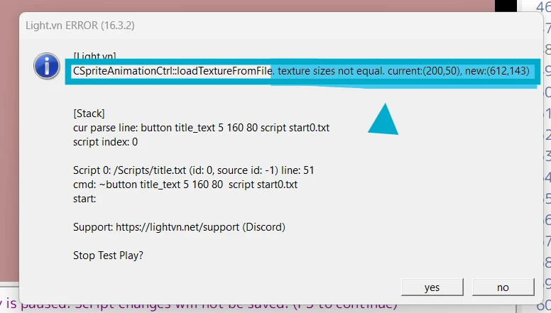
You'll see this message: "texture sizes not equal". After that, it will also show you the size of the idle image and the hover image. Both images need to be the same size for light vn work normally!
But that's not the only information you'll see on the pop-up screen.
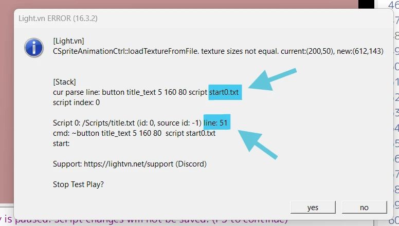
Another thing you can find on the screen is that it can tell you exactly where the error happened
You'll see which text file has the problem and also which line it's on. This makes it super easy to find and fix the mistake!
Usage
So what does it look like exactly?
~touchableRes [untouched image] [touched image] [clicked image] (touched sfx) (clicked sfx)Example:
~touchableRes Custom_UI/quit_idle.png Custom_UI/quit_hover.png Custom_UI/quit_hover.png- In this case, when the button isn't touched, the player will see the image "quit_idle.png"
- When the player hovers their cursor over the button or clicks it, the image will change to "quit_hover.png"
Also, in this case, there are no sound effects when the button is touched or clicked. But don't worry! We can add them by putting the sound file's path at the end of the line.
Like this:
~touchableRes Custom_UI/quit_idle.png Custom_UI/quit_hover.png Custom_UI/quit_hover.png button_sound/button.mp3 button_sound/click.mp3- We added "button_sound/button.mp3" and "button_sound/click.mp3" to the line above
- Now, the button has sound effects!
- When you hover over the button, you'll hear "button.mp3"
- When you click it, you'll hear "click.mp3"
Now we are done with what we can do with touchableRes!
We can actually skip this step but I'll talk about it later!
2. Button
If we just add touchableRes, we can not see button yet. We need to add 「button」 command to see it!
And the following definition can be added to button command:
button [name] (untouched image) (touched image) (clicked image) [x] [y] [layer] (ignoreTrans) (on_camera) (Light.vn command)[name]: (Required) This is the unique identifier for your button(untouched image): (Optional) The image displayed when the button isn't touched. If you set this along with(touched image), they must be the same size to avoid errors(touched image): (Optional) The image displayed when the cursor hovers over the button or when it's clicked. If you set this along with(untouched image), they must be the same size. You can reuse this image for both hover and click states(clicked image): (Optional) An alternative image displayed only when the button is clicked[x] [y]: (Required) The position of the button on the screen (x-coordinate, y-coordinate)[layer]: (Optional) The layer on which the button is displayed. Buttons on higher layers will appear on top of buttons on lower layers.(ignoreTrans): (Optional) If your button image has transparent areas, you can use this to prevent those areas from being clickable.(on_camera): (Optional) normally not needed(Light.vn command): (Optional) Here you can specify an action to perform when the button is clicked. We'll discuss this further later!
Additional Notes:
- You can set the idle, hover, and clicked images using the
touchableRescommand beforehand, eliminating the need to specify them here if they're the same. - Make sure the button layer isn't hidden behind other elements like the background image.
Usage
Let me give you an example of how to use this command:
~button title_quit 1 510 80 jump scene_endAs you can see here, I didn't use many parameters because I didn't need them.
Here's what I set:
- name of the button: "title_quit"
- position of the button: "1 510"
- action: jump scene_end
As I mentioned before, adding "touchableRes" isn't strictly necessary.
If you skip touchableRes, you can create your button in light vn like this:
~button title_quit Custom_UI/quit_idle.png Custom_UI/quit_hover.png Custom_UI/quit_hover.png 1 510 80 jump scene_endThis way, you can still set the untouched, touched, and clicked versions of your button!
3. btnText
- If you want to add text on top of the button image, you can use the
btnTextcommand.
- This lets you customize the text on your button!
- If you've used other game engines before, you might know this as a "textbutton."
- This way, you can reuse a single button image to create many different buttons with different text, saving you time and space in your project!
Usage
The following things can be set using the btnText command in light.vn:
btnText [button name] [font filename] [font size] (x-from-center) (y-from-center) ["text"][button name]: This should match the name of the button you created earlier[font filename]: The name of your font file. (Place your font files in a folder named "Fonts")[font size]: The size of the font for the button text(x-from-center): Optional. Adjusts the horizontal position of the text relative to the center of the button(y-from-center): Optional. Adjusts the vertical position of the text relative to the center of the button.["text"]: The text that will appear on the button.
Here's an example:
~btnText title_quit SourceHanSansLite.ttf 40 "Quit"In this example, I didn't define all the possible options, just the necessary ones.
Here's what I set:
- Button name:
title_quit - Button text font:
SourceHanSansLite.ttf - Font size: 40
- Text: "Quit"
4. Use the same background for all buttons
We can use the same background and sound effects for multiple buttons. To do this, simply add the touchableRes command first, then create your buttons.
When you use the button command, a new touchableRes will be generated automatically.
You can delete this extra one ("touchableRes ") to use the previous one.
Another way is to copy and paste the last button you created and then adjust its position and text.
So you can do something like this in light vn:
~touchableRes Custom_UI/blank.png Custom_UI/blank.png Custom_UI/blank.png
~button title_text 5 160 80  script start0.txt
~btnText title_text SourceHanSansLite.ttf 40 "Start"

~button title_load 5 230 80  script system/load.txt
~btnText title_load SourceHanSansLite.ttf 40 "Load"

~button title_Preferences 65 300 80 script system/config-system.txt config_in_first
~btnText title_Preferences SourceHanSansLite.ttf 40 "Preferences"

~button title_About 10 370 80  jump file.txt
~btnText title_About SourceHanSansLite.ttf 40 "About"

~button title_Help 1 440 80  jump file.txt
~btnText title_Help SourceHanSansLite.ttf 40 "Help"

~button title_quit 1 510 80  jump scene_end
~btnText title_quit SourceHanSansLite.ttf 40 "Quit"
In this example, we only define the image once, and the style will be applied to every button below.
FAQ: Some Common Questions
Why can't I see my button?
If you can't see your button even though you've written the button statement in your script, it might be because of how you wrote the button command.
- Check if it's written as "button0". If it is, you need to add "fadein" followed by the button name to make it appear
- Another option is to remove the "0" and just use "button".
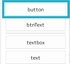
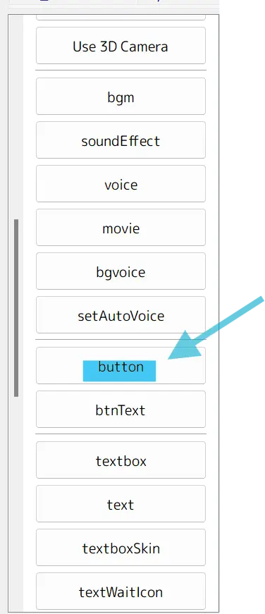
Where is the "button" button in light vn?
It is below 「SetAutoVoice」 and above 「btnText」 (I am using version: 16.3.2)
Check last episodes:
Next time, we will delve deeper into more functions of Light VN and customizing other parts of the Light VN UI. Meanwhile, you can check out the last episodes!
- Light vn Tutorial / Compare Command【Customize UI#001】 - Title / Main Menu
- Renpy To Light.vn Tutorial / Compare Command【Advanced #005】 - Text Tag
- Renpy To Light.vn Tutorial / Compare Command【Basic #004】 - Text Tag
- Renpy To Light.vn Tutorial 【Basic #003】 - Play Audio
- Renpy To Light.vn Tutorial 【Basic #002】 - Showing dialogues
- Renpy To Light.vn Tutorial 【Basic #001】