Hello & Welcome to today's post~
Today I will continue talking about Light.vn - a japanese visual novel game engine!
Today's topic:
- Use buttons
- Show images
- Add sound effects for buttons
- Add background music to the main menu screen
Let's build this together by creating a real screen!
We'll be working in the "title.txt" file btw. (ofc, if you want to work in other txt, you can also do it ~)
By the end of this section, we'll have created this together!
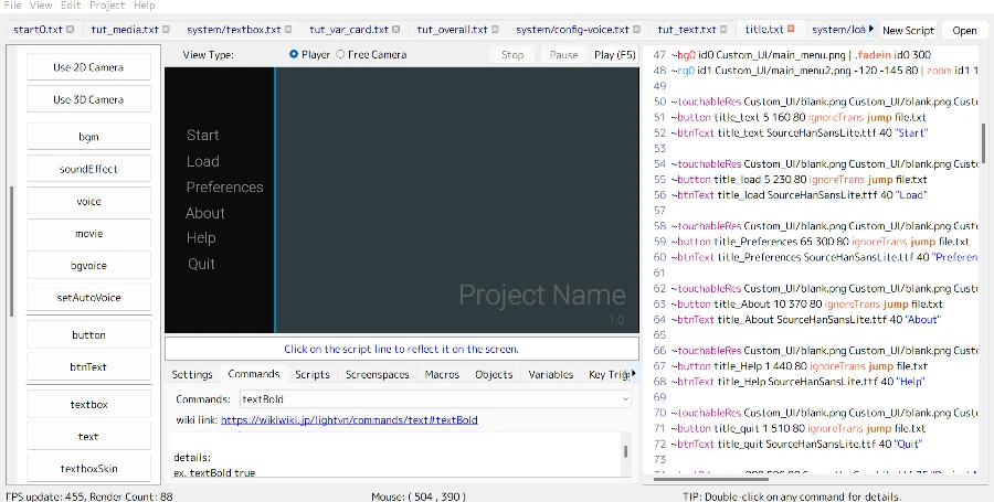
Light.vn UI Customization: Title / Main Menu Screen
Add Background
So first, we want to add background images to the screen.
And to do so we can click on the button on the left side:
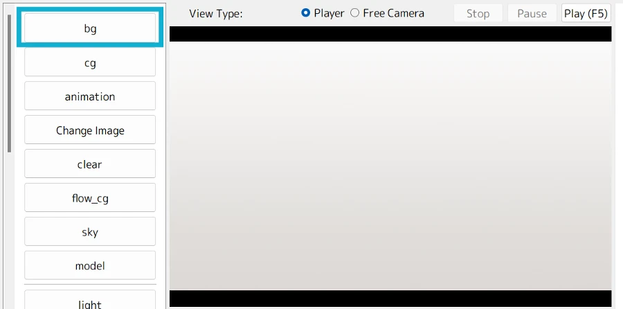
Then, from the window that popped up, pick the background image you want to use.
Add Button
Next, we need to add buttons to the screen.
In Ren'Py, we have multiple textbuttons on the screen. However, I couldn't find a directly equivalent feature in Light.vn ("textbutton") to just look something like this:
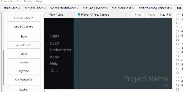
Therefore, we'll add a normal button with an image as its background (similar to an imagebutton in Ren'Py). Before adding the button, however, we'll need a transparent background image for it
If you don't have a transparent background image or are unsure how to export one from your image editing software, you can download one here:
Then, you can click the "button" button and pick that transparent image
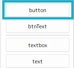
After you pick the image, you can directly choose its position on the screen. Simply place it on the left side.
Light.vn will then automatically write the code in the script file on the right side.
~touchableRes Custom_UI/blank.png Custom_UI/blank.png Custom_UI/blank.png
~button0 id0 40 150 80 jump file.txt
~zoom id0 100% | .fadein id0 300- Your code probably won't be exactly the same as mine
- Image path: In my example, I placed the image in a folder called "Custom_UI." So, your image path might be different depending on where you saved your image
- Button position: You might click the image to place it in a different position on the screen. This will change the
xposandyposvalues in the code. (Mine are "40 150," = "xpos 40 ypos 150") - Button ID: The code uses an ID called "id0" for the button. You might have a different ID assigned by Light.vn, or you can rename it to something else
Add Text to Button
To do so, we can click the button "btnText", then we will need to pick which font we want to use
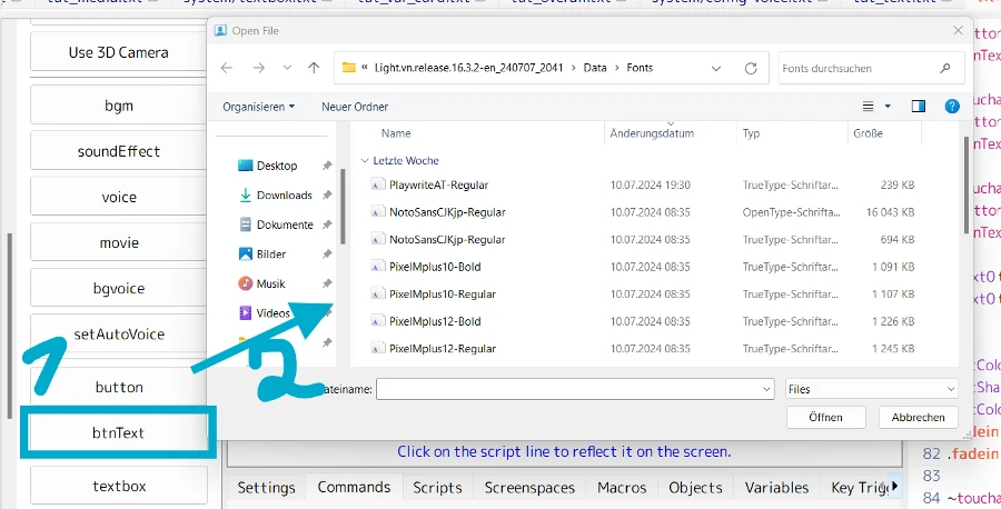
Here's what you'll see after picking the font:
~btnText target_name PlaywriteAT-Regular.ttf 24 "I'm a master of letters."Things you'll need to change:
- "target_name": Replace this with the ID you defined for the button earlier
- Text "I'm a master of letters.": Change this to something else, like "Start" or "Load"
Adding More Buttons: Repeat this process for any additional buttons you want to add to the screen
Styling Text:
To style the text, you can use the command 「textColour」 like this:
Example:
textColour title_.* #888888- I've named all my buttons something like this:
- title_start
- title_load
- title_about
- title_help
- etc.
- Therefore, you can simply set the
target_nameto"title_.*". This style will apply to every button that starts with"title_" - The code above will change the text color to "#888888".
And you can also change the text size quicky by doing something like this:
textSize title_.* 33- With the command 「textSize」, you can change the font size in ligh.vn
- and the code above will cahnge the text size to 33
Add Project Name and Version
The last step is to add the project name and version to the bottom right corner of the screen.
Here's how to do it:
1. Click the "Text" button.
2. Choose the font you want to use
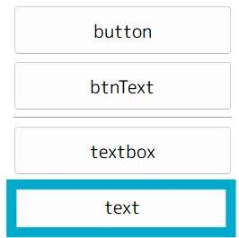
After selecting the font, you'll see something like this in the script on the right side:
~text0 id2 916 607 80 SourceHanSansLite.ttf 28 "I'm a master of letters." | fadein id2 300Note:
- Your code might differ slightly. Because we might have positioned the text differently, and Light.vn might assign a different ID name. However, this won't affect the final steps.
- We'll need to make some minor changes regardless, so don't worry about these initial differences
Here's an example how to adjust the code:
text t_name 800 586 80 SourceHanSansLite.ttf 75 "Project Name"- Here, I've assigned a new name to it: "t_name"
- I've also changed the position to xpos 800, ypos 586
- and the font size to 75
- Finally, I've replaced the text with "Project Name"
Same step with version, I've this code:
text t_version 1200 670 80 SourceHanSansLite.ttf 33 "1.0" |So ~ you're finished now!
Now you should have similar screen like I've here:

Note:
- I didn't assign action to the button
- As well as hover version
Note: Remove ignoreTrans !
- If you use the 「button」 to add a button, the "ignoreTrans" flag will be automatically added. This behaves similarly to Ren'Py's "alpha" flag, where transparent areas become untouchable / unclickable.
- However, this is undesirable for us since our entire button relies on transparency background
- Consequently, it would render the button unusable.
Example 2: Custom UI in Light.vn
And ~ here's 2nd example to make it more clear ~!
This time I'd custom the main menu UI to this:
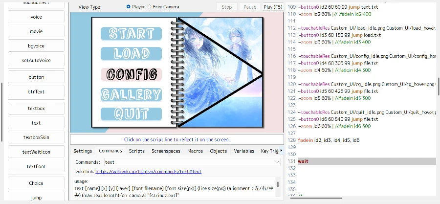
So, let's start with the background image
1. Adding a Background Image
Just like before, you can use the "bg" command or click the "bg" button on the left side to add a background image
2. Adding Buttons
The process for adding buttons is similar. Click the "Button" button or type the 「button」 command
Then, choose the image you want to use. After selecting the image, you'll see code similar to this:
touchableRes Custom_UI/start_idle.png Custom_UI/start_hover.png Custom_UI/start_hover.png- Light.vn currently only allows you to pick one image for the button. This means your idle state, hover state, and selected state will all use the same image.
- However, you can easily change the paths as shown above
- Simply replace the second path with the path to your hover version image
- and the third path with the path to your selected version image
To make it clearer:
touchableRes [untouched image] [touched image] [clicked image] - 1. position = idle version
- 2. position = hover version
- 3. position = selected version
This time since we just want to use imagebutton, we don't need extra text on the button so we don't need the command 「btnText」 this time !
And we just need to repeat the same process to get this:
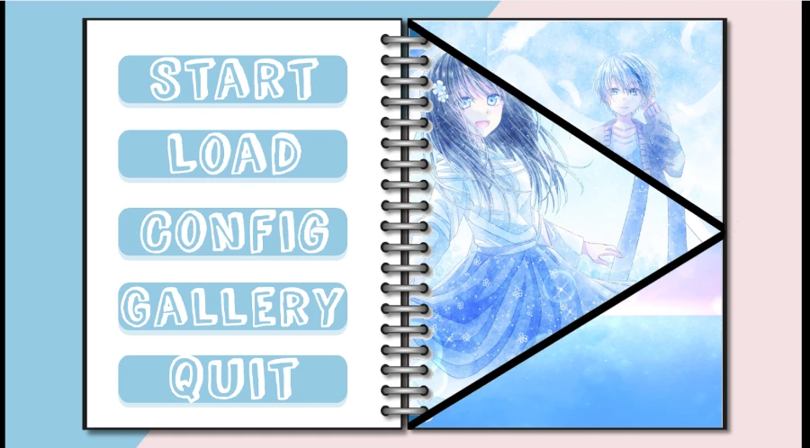
If you can't see the button
- You might encounter an issue where buttons appear hidden behind the background image
- This happens because Light.vn uses layers to determine which elements are displayed on top of others
- And your button might be at the same layer as background image
Solution: Adjusting Button Layer
- To fix this, you can change the layer value of the button in the code. Higher layer values are displayed on top of lower values.
Like this:
button id4 60 305 99 jump file.txt- in this example I set the layer to "99" and its above the background image
- since I've this code for my background:
cg id1 Custom_UI/notebook.png -160 -160 80- The layer = "80"
So quick summarize:
- The button code (
button id4 60 305 99 jump file.txt) sets the layer to"99", placing it above the background image. - The background code (
cg id1 Custom_UI/notebook.png -160 -160 80) has a layer of"80", positioning it below the button. - So now you should be able to see the buttons!
Add Sound Effect
Before assigning sound effects to buttons, I'd recommend to organize them in a separate folder within your game directory (SFX folder).
For example, you could create a folder named "button_sound" (its just my preference tbh. www)
Next is to assign the sound effects to the button like this:
touchableRes [untouched image] [touched image] [clicked image] (touched sfx) (clicked sfx)The touchableRes command takes additional arguments for sound effects after the image paths.
(touched sfx): This specifies the sound effect that plays when the mouse hovers over the button(clicked sfx): This specifies the sound effect that plays when the button is clicked
Example:
touchableRes Custom_UI/start_idle.png Custom_UI/start_hover.png Custom_UI/start_hover.png button_sound/button.mp3 button_sound/click.mp3In this example:
Custom_UI/start_idle.png: Path to the idle image of the buttonCustom_UI/start_hover.png: Path to the hover image of the button (used for both hover and clicked states)button_sound/button.mp3: Path to the sound effect that plays when the mouse hovers over the buttonbutton_sound/click.mp3: Path to the sound effect that plays when the button is clicked
Assign Action to the Buttons
You can define custom actions for buttons by adding code after the layer position in the code.
Here are some examples
Example 1: Loading a Load Script
button0 id3 60 180 99 script system/load.txt- In this example, the action is
"script system/load.txt" - This code will load the script named "load.txt," which displays the load screen to the player
Another exmaple:
button0 id2 60 60 99 script start0.txt- Here, the action is
"script start0.txt" - This code will load the script named "start0.txt," which shows the story text the player
And this is today's post!
I hope this post helped you!
[…] Light vn Tutorial / Compare Command【Customize UI#001】 - Title / Main Menu […]